
Excel may not be where the data originated from and there may well have been a database involved to crunch numbers and aggregate to the point that the data would fit comfortably in Excel, but I do believe that it's still the most widely used tool for final 'analysis' and presentation of data.
This is not because Excel is the best tool for the job as almost every feature of Excel is handled better by another tool. Joining separate tables of data with Lookup functions is a very pale shadow of using a properly defined database and the SQL language. There are substantially better graphics, charting and visualization tools available. The analysis tools (Correlation, Regression, ANOVA, Linear-programming) are the poor relation to more industrial strength packages.
So why do we (almost) all use Excel? Perhaps because it is so very accessible? It's cheap enough that everyone can have a copy. Simple enough that everyone can make at least some use of it and the tools are good enough for most of the uses that it's put to.
I worked recently with a Demand Signal Repository (DSR) that is used to analyse and report on 3 Terabytes of Point of Sale data. (FYI - 3TB is equivalent to around 6 million average sized spreadsheets). The data is held and crunched in Microsoft's SQL Server database using a highly unusual (but very effective) data structure combined with a application specific querying engine that rapidly dumps out the data you need for reporting into ... Excel! Once in Excel I have routinely turned to pivot-tables for 90% of the reporting.
- They are very fast to build
- They can be very flexible to change. A good pivot-table report built for one brand or store or manager will run just as effectively for any other, just change the data and re-run.
- They typically require no coding at all. Reports that need custom code are always going to be more fragile than ones that use well-designed, heavily tested and heavily used code.
- They are immediately drill-able to the lowest level of detail that you pulled into the spreadsheet
- With a few tricks up your sleeve to deal with some of the limitations of pivot-tables, you can get a very long way, fast.
Pivot-tables are not perfect, they have a number of foibles, but, there are 2 things that pivot-tables absolutely will not do that cause me the most problems:
- Pivot-tables do not implement so called "semi-additive" measures. I know that sounds nerdy but its a real problem when you are dealing with inventory. A semi-additive measure is one that is additive in some dimensions but not all.. If I am working with Inventory data, I can reasonably add across locations and products and get a sensible answer. If I have $100 of inventory for each of 10 products at each of 5 stores , I do have 100*10*5 = $5,000 worth of inventory. You cannot do this across time. If I have $5,000 of inventory at the start of the week and $6,000 at the end of the week I do not have $11,000 of inventory. What this means for Pivot-Table reporting is that I cannot aggregate data across time directly in the pivot-table, neither can I drill-down on that dimension.
- The second issue is with graphical display. Pivot-charts seems so weak in comparison to the pivot-tables used to create them.
There is not much I can do about the first one other than be aware of it, await a better though probably much more complicated tool and warn others . (I''ve just checked that off my list)
The graphical display issue I can do something about. The main problem is this: once I get a pivot-chart set up as I need it for one group of products or locations, then to see the next group I must select it from a Page Field filter. Look at the example below. (The Page Field filter is in cell B1). I've built a pivot-chart on top of the pivot-table (not one of my best, this was just for testing), embellished it with a few formulas that update with the pivot-table and formatted the 2 into one area that should print well.

If there are 10 of these groups I must change the filter 10 times to see them all. If I want to compare and contrast between them I must flip-flop back and forth or print them all, one to a page. Not very satisfactory and severely limiting for reports that people expect to just print.
What I've wanted for some time now (and finally built) was an add-in that would take care of this. An Excel add-in:
- that builds grids of reports with multiple copies of a template sized to fit the page.
- where report templates are just a range of cells in a worksheet so that you can build templates with: charts, formulas, images, pivot-tables, text boxes, anything that can be added to the worksheet.
- where you specify the template and output in a dialog box (without coding)
Refresh the Pivot-table with new data and with 1 click of the mouse (or 1 line of code in a subroutine if you prefer to automate) and it will rebuild adding or removing copies of the template as required to fit the data that's now there.
We've actually added rather more functionality to this that I originally planned, the full feature list is shown below:
- Lightweight, Microsoft-Excel add-in (2007, 2010)
- Easy to install and easy to use.
- Templates are just a range of cells in a worksheet.
- Build templates with: charts, formulas, images, pivot-tables, text boxes, anything that can be added to a worksheet.
- Layout tools make it easy to build clean, professional templates.
- Select the number of rows and columns per page in your report
- Automatically scale to fit the page-size and orientation.
- Generate multiple 'Grids in the same workbook
- Work with multiple page-fields so the rows and columns have meaning
- Optionally add outlines, border gaps and shadows
- Refreshes in seconds, on demand.
- Write the chart legend to a header section, printed on each page
- Lock value axes so they all show the same range
- Easy to automate
This tool will be released soon as a free add-in that you can download from (www.crabtreeanalytics.com). For the next few weeks, it's going through beta testing .
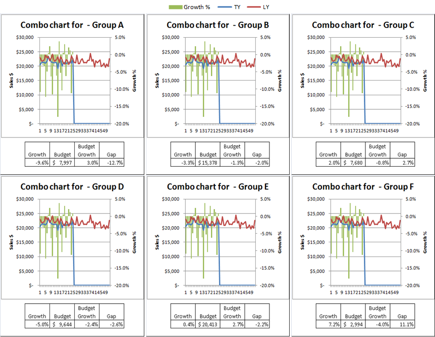
Here are a few more examples of the output:
 |
| Bar Charts |
 |
| Scatter Plots with regression lines and a data driven text box |
| New product tracker, Distribution, Units per Store per Week and Total Sales 3 charts per cell, all from 1 pivot-table |
 |
| Histograms with summary statistics |
No comments:
Post a Comment
Note: Only a member of this blog may post a comment.